Tangelo
UX Revamp
I was charged with re-envisioning the UX of a task management system to refine task statuses and improve the clarity of the task table.

UI Design
UX Design
User Research
Tangelo transforms the onboarding process by creating simple and engaging experiences for new hires, ensuring they feel welcomed and prepared to contribute from day one. By focusing on user-friendly design and interactive elements, Tangelo supports growing teams in seamlessly integrating new employees, allowing them to hit the ground running and thrive in their roles.
I was tasked with redesigning the onboarding task management system to enhance user experience and clarity. Users have expressed confusion regarding task statuses, resulting in a cluttered interface with overlapping text that hampers usability. My goal is to re-envision the table-style view for workflows and tasks, ensuring that updates from various sources are presented clearly.
By addressing these pain points, I was able to create a more intuitive and organized platform, making task management straightforward and efficient.
Paint Point(s): “In the real-world use of our application it gets really messy as the status of tasks (emails, slacks, calendar events, to-dos) are updated in the app”
Experience enhancements:
Add a tag system for task status
Restructure the task table with clear columns and rows (Icon, Task Name, Status, Last Updated, Task controls; Re-Import, refresh?)
Project Goal: Re-envision the table style view for workflows and tasks assigned to users for better usability

Inspiration: Modern table UI designs, clearly defined visual hierarchies, “timeline” style format.

Iteration #1 - Minor changes from the original design provided. Status exploration.
Iteration #2 - Improved readability of current task status with unique task status tags. Clearly defined the columns, improving the hierarchy of info

Iteration #3 - Added final UI touches. “Add task” and “import task” were reworked into the task list itself, which results in a less crowded UI. Opted to simplify the table titles and drop “Updated” as it didn’t make sense in context. Instead, Status now encompasses all things related to a task’s status.
Iteration #4 - Client provided suggestions on UI adjustments for better flow of information and use of white space.
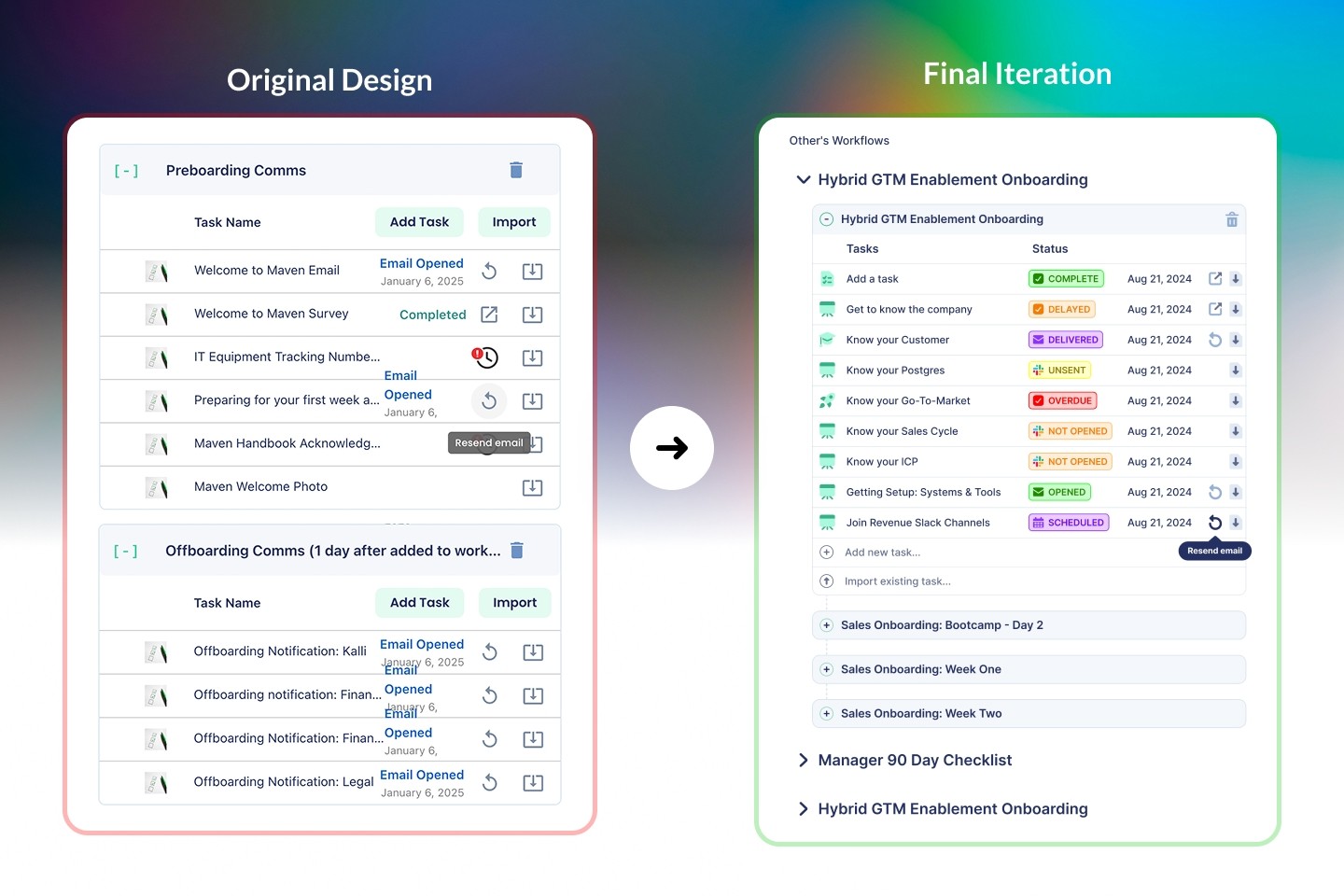
Final Iteration: Changed statuses to include task type (Email, Slack, Task, Calendar) and streamlined the color to indicate status.
Incomplete, Unsent (Yellow)
Delayed, Not Opened (Orange)
Overdue (Red)
Complete, Opened, Invite Sent (Green)
Scheduled, Delivered (Purple)
